The Coca-Cola Company “Bubbler”
Business Intelligence Data Visualizer
Brief as received
The Coca-Cola Company is one of the most advanced brands in the world when it comes to business intelligence. We have established a direct link between monthly aggregated sentiment and TCCC case-sales the world over.
The Executive team wants to easily get a feel for what is happening across our brands in real time. They asked to see this as a report on a daily basis, not a monthly roll-up after the fact, but the current formats from our social listen tools are not compelling or easy to understand.
Design a real time Business Intelligence dashboard for TCCC Executives that delivers quick, easy and timely global social understanding across Vitamin Water, Fanta, Diet Coke, Coca-Cola, Coke Zero, Sprite, Dasani, Simply, Powered and Minutemade that can be accessed from a tablet.
Research & Insights
Interviewed TCCC Executives and all complained about complexity.
Tablets meant It was going to have to be developed in HTML5.
Real time access was going to be hard to get and difficult for technology to handle.
Re-framed brief
How can we visually “bubble up” what matters most to how people are feeling about The Coca-Cola Company Brands?
Sharpened audience definition
Not just TCCC execs, everyone at TCCC wanted to access something like this.
Problem identified
So many problems… technology, data access… so many.
And there was the design development itself… how do you look at what everyone on earth is saying?
Insight that shed new light
We need to “bubble-up” whats important…
WAIT A MINUTE!!
Marketplace & cultural understanding
Multitouch was taking over.
No UI, just touch. It’s a vibe.
A new way of thinking about the product or brand
Create the most “refreshing” way to access and understand Coca-Cola’s consumers.
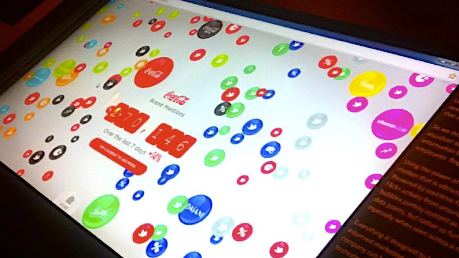
All TCCC brands are like colored bubbles in a sea of effervescence.
Work the brief inspired
The Coca-Cola “Bubbler” - multitouch, data visualizer.
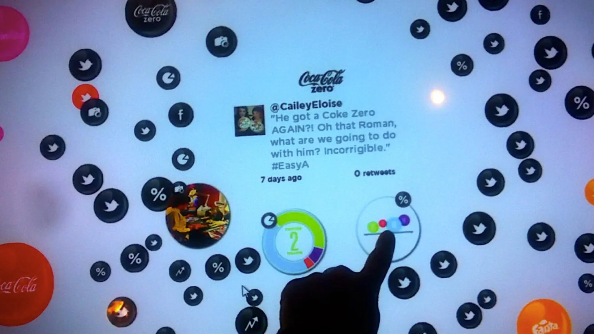
The Bubbler embraced simplicity to increase understanding. Each bubble, defined as a brand or social media outlet, “pops” to reveal natural user experience, robust charting and easy to understand graphs.
The HTML5 based Bubbler provided radical transparency into how consumers feel about the largest brands in The Coca-Cola Company, at any given time, during any given day, and was a “refreshing” and fun way to access and understand Coca-Cola’s consumers.
On the back-end The Bubbler pulls data from various web services across the world at specific regular intervals, compiles for practicality so it can be visualized.
It tracks metrics such as: key word mentions, brand comments, video tags, tweets, and pictures, and automatically visualizes them as an effervescent “sea of bubbles” UX that provides, robust charting and easy to understand graphing.
Senior management had access to the site via their tablets enabling them to explore both what was being said/posted about their brands, as well as understand it as concrete information at an aggregated level to inform their work.
Results
The Bubbler was so well received by the clients, they had us install it in the lobby of the “executive tower” at the TCCC campus in Atlanta.
The Coco-Cola Executive Team said it was “by far” their “most fun Business Intelligence” tool.


